
Paying off a decade of accessibility debt using SwiftUI accessibility APIs, which aren’t as intimidating as they might seem.
Accessibility is something I used to take for granted and didn’t think much about in everyday life. I didn’t consider it at all when I first developed Decrypto ten years ago. That was probably because I had the huge privilege of never having to face accessibility challenges myself, a comfort which I didn’t fully recognize until much later. That, and the fact that building a game using a third-party C++ library didn’t exactly make things easier.
Well, I’m glad to say this new Decrypto release includes full VoiceOver support. All levels, hints, and explanations have been transcribed. Navigation and other parts of the experience have also been reworked to be much more accessible. Somewhat fittingly, it also almost lines up with Global Accessibility Awareness Day.
SwiftUI Accessibility

Before you do any accessibility development, I strongly suggest:
- Go to settings, find Accessibility Shortcut, and add VoiceOver
- Go over the basic VoiceOver gestures
- Turn on VoiceOver and play around with Apple apps to get a feel for how things work and what users might expect
Basics
Typing .accessibility in Xcode can feel overwhelming. You get hit with a wall of methods, and the scroll bar just keeps going. SwiftUI doesn’t exactly make it easier with its overrides. But honestly, if you stop and take a breath, it’s not as bad as it looks. SwiftUI gives you pretty good defaults out of the box, and most accessibility improvements only need a few simple modifiers.
Let’s take a real-world example and break it down using those modifiers. Here’s a VoiceOver announcement you might hear in Decrypto:
"Hint. Locked. Button. Double tap to unlock using 2 keys."
This can be represented visually like so:
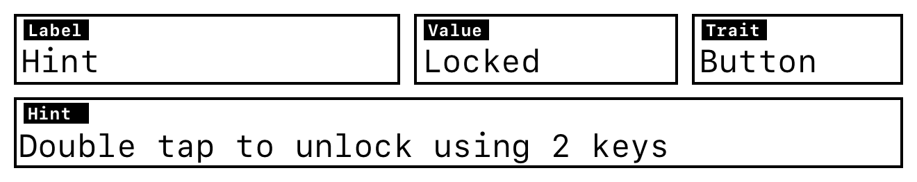
And you can build it with these basic accessibility APIs:
.accessibilityLabel
A short description of the element. In the example above, that’s "Hint". It’s the first thing VoiceOver will read, so even if you’re tempted, don’t make it too long.
.accessibilityValue
The current value of the element. Here, it’s “Locked”. I thought I’d use this one a lot more, but honestly, I’ve only used it a handful of times.
.accessibilityAddTraits
Traits describing what kind of thing the element is. In this case, the trait is “Button”. In general, use the built-in SwiftUI controls when you can, because they come with the right traits by default.
.accessibilityHint
A short hint that tells the user what will happen when they interact with the element. In this example it would be "Double tap to unlock using 2 keys".
Here’s how it comes together in code:
hintView
    .accessibilityLabel("Hint")
    .accessibilityValue(Text("Locked"), isEnabled: hint.status != .unlocked)
    .accessibilityHint(accessibilityHint, isEnabled: hint.status != .unlocked)
    .accessibilityAddTraits(
        hint.status != .unlocked && helpPoints >= hint.cost
            ? [.isButton]
            : []
    )
You can go really far with just these modifiers. And you don’t need to use all of them. More isn’t better. Sticking to the SwiftUI defaults usually gives you better accessibility. Most default controls don’t need much tweaking.
Now, for custom controls or special cases, SwiftUI has a super useful modifier called .accessibilityRepresentation. It lets you describe your custom view in terms of a built-in accessible view. You get the built-in behavior for free. For example, I used it to give my custom DisclosureGroup the right accessibility:
Text(title)
    .accessibilityRepresentation {
        DisclosureGroup(isExpanded: $showItem) {} label: {
            Text(title)
                .accessibilityAddTraits(.isHeader)
        }
    }
I can’t overstate how great this is. Just like that, VoiceOver knows if it’s expanded or collapsed and treats it like a header.
Another pretty useful modifier is .accessibilityHidden. It’s great for skipping over decorative stuff that just clutters up the VoiceOver experience. For example, I used it for the game logo on the game completed screen:
header
    .accessibilityHidden(true)
And finally, one more basic but powerful modifier is .accessibilitySortPriority. It lets you control the reading order. It only affects elements on the same level, but that’s usually enough.
I used it to make sure the Help button is read first in the navigation menu, since it’s more important than, say, Settings.
.accessibilitySortPriority(navigationAction == .openHelp ? 0 : -1)
While I could’ve just reordered the buttons in the layout when VoiceOver is on, I think it’s better when the UI feels the same whether VoiceOver is on or off.
Extras
The next powerful and very useful API is .accessibilityFocused. It’s very similar to the regular .focused SwiftUI API. Not surprisingly, it also lets you control focus programmatically.
In my case, I ran into a problem where, after showing an explanation and closing it, VoiceOver would reset focus to the first element on the screen. One of those tiny but annoying things that could get in the way for someone relying on VoiceOver.
While you can fix this easily by just using .accessibilityFocused, I wanted a more reusable solution I could use across the whole app.
First, I defined a few accessibility items that might need programmatic focus:
enum AccessibilityItem {
    case help
    case level
    case menu
    case explanation
    case scratchpad
}
Then created an environment value to store the accessibility focus state:
@Entry var focusedAccessibilityItem: AccessibilityFocusState<AccessibilityItem?>.Binding? = nil
Next, I injected the value into the environment at the root of the app:
.environment(\.focusedAccessibilityItem, $focusedAccessibilityItem)
After that, added a small helper to make the focus API easier to use:
extension View {
    func accessibilityFocus(
        for item: AccessibilityItem
    ) -> some View {
        self
            .modifier(AccessibilityFocusItemViewModifier(item: item))
    }
}

fileprivate struct AccessibilityFocusItemViewModifier: ViewModifier {
    let item: AccessibilityItem

    @AccessibilityFocusState
    private var defaultFocusState: AccessibilityItem?

    @Environment(\.focusedAccessibilityItem)
    private var focusedAccessibilityItem

    func body(content: Content) -> some View {
        content
            .accessibilityFocused(focusedAccessibilityItem ?? $defaultFocusState, equals: item)
    }
}
After all that setup, using it felt pretty clean. In the explanation view, I just mark it like this:
explanationView
    .accessibilityFocus(for: .explanation)
And when the explanation view is dismissed:
onDismiss: {
    focusedAccessibilityItem?.wrappedValue = .explanation
}
That’s it. Adding a new focusable item is just a matter of creating a new enum case and using it where needed.
Another slightly more advanced API I played with was .accessibilityRotor. The idea was to create a rotor that lets users jump between scenes more quickly. Since I was already using .accessibilityFocused, setting up the rotor was pretty straightforward:
.accessibilityRotor(Text("Active Scene")) {
    ForEach(DecryptoScene.allCases, id: \.self) { scene in
        if scene != vm.activeScene {
            AccessibilityRotorEntry(Text(scene.name), id: scene) {
                focusedAccessibilityItem?.wrappedValue = scene.entry
            }
        }
    }
}
The only catch is that AccessibilityRotorEntry gives you a closure where you can prep the view. Without that, in my case, the scene wasn’t even visible yet, so the rotor wouldn’t do anything.
In the end, I took it out, for now. It didn’t feel all that helpful and wasn’t very responsive during testing. But if VoiceOver users say it helps, I’ll happily bring it back. Still, pretty cool and surprisingly simple API.
One more useful API is AccessibilityNotification. I used it in a few spots where the context changes, hoping it would provide more clarity or feedback to the user. I’m a bit on the fence about this one. I can see how it might get annoying, but for now I’d rather wait for actual feedback from real users instead of guessing.
To use it in a cleaner way (since all my calls looked basically the same), I wrote this little convenience API:
extension AccessibilityNotification {
    static func announce(message: String) {
        var highPriorityAnnouncement = AttributedString(message)
        highPriorityAnnouncement.accessibilitySpeechAnnouncementPriority = .high

        AccessibilityNotification
            .Announcement(highPriorityAnnouncement)
            .post()
    }
}
It does exactly what you’d expect. It announces some message to the user. In my case it would announce that the active screen changed.
In some places, I also used AccessibilityNotification.ScreenChanged even though I’m not totally sure it does anything in the SwiftUI case. I didn’t notice any difference with or without it, but I figured it couldn’t hurt as semantically the screen was changing.
Mentality
This part isn’t really about code. It’s about mentality. For example, in Decrypto, when you enable VoiceOver mode, input and navigation change. One of those changes is that instead of interactive input, you’re presented with a standard text field. I believe the overall experience is better this way, but there’s one thing that has nothing to do with coding or APIs.
With interactive input, you can see how many letters are in the encrypted word. That’s a built-in advantage. But with a regular text field, that visual hint disappears. So just adding a small view modifier like this:
.accessibilityHint(Text("Enter \(answerLength)-letter decrypted word"))
Makes the game way more balanced and fair. Same goes for labeling the clues. You can’t just slap labels on and call it done. Sometimes you’ve got to tweak things so it actually makes sense and feels fair for people using VoiceOver.
Conclusion
While typing accessibility in Xcode and seeing a huge list of autocomplete options might feel a bit overwhelming, it’s actually not that scary. From my own experience:
- Using the default SwiftUI controls got me about 80% of the way there
.accessibilityLabelgave me another 8%.accessibilityHintadded around 4% more.accessibilityAddTraitsgave me maybe 2%.accessibilityValueadded another 1%.accessibilitySortPriorityhelped fix some of those 1% issues.accessibilityRepresentationpushed me another 2%.accessibilityFocusgot me the last 2%
Obviously that “100%” is a made-up thing that just represents where I am now. It’s still most likely not the ideal VoiceOver experience, but at this point I think that real VoiceOver users can guide me further the best. I can make assumptions and try to do what I think is helpful, but at the end of the day, I can’t assume that I know better than the people actually using it in their daily life.
If you found this post helpful, or just enjoyed this little corner of the internet, you might also like a few of the other things I make.
- Mudu: a calm space for couples, families, and close friends.
- Decrypto: a cipher puzzle game for curious minds.
No tricks. No weird little traps. Just software made with care by a person who still thinks it can have a soul.